Comeo
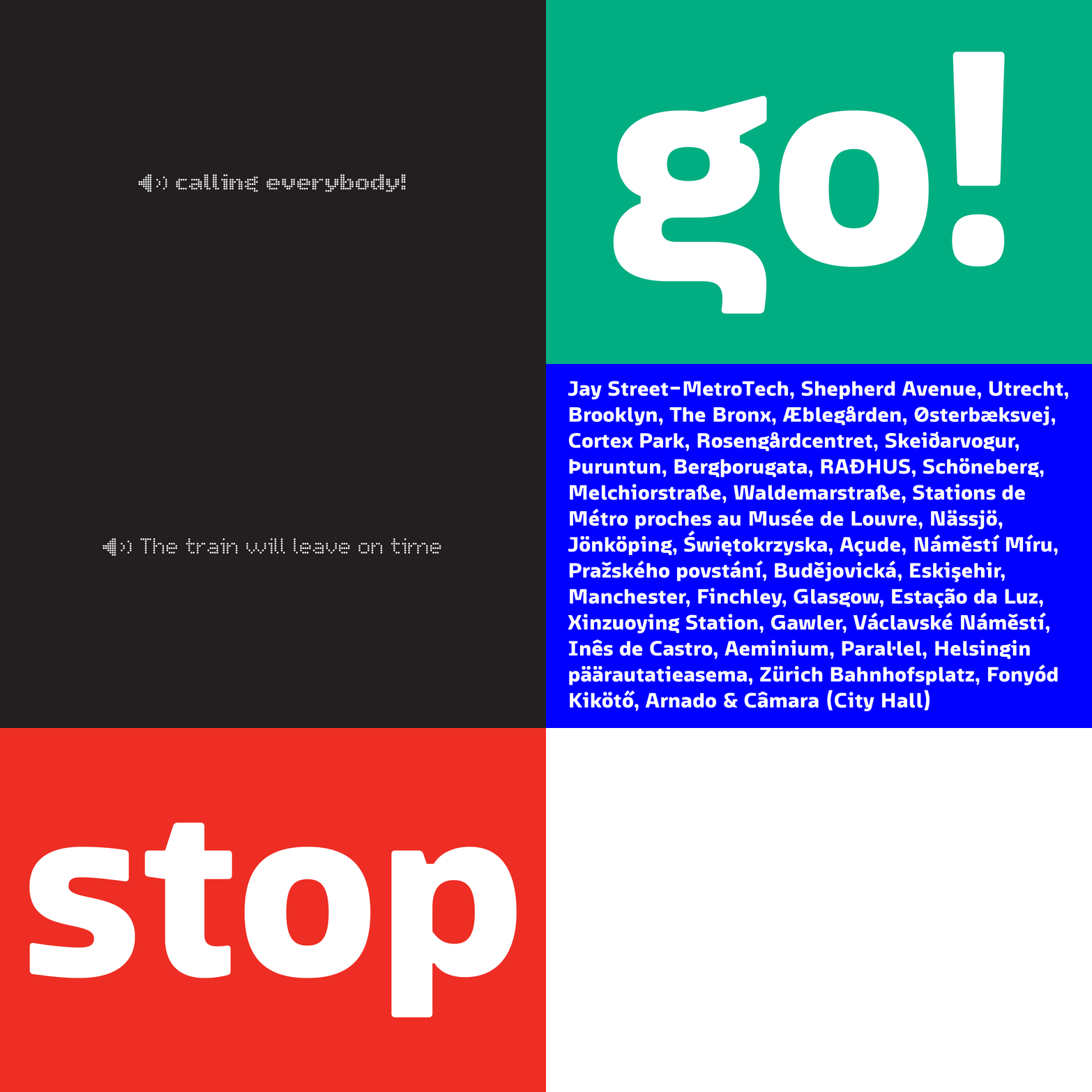
Comeo is a custom made typeface for the light rail in the City of Odense. The task was to design a typeface for signage & text, contemporary with a sense of Danish railway history and the result was a family of 13 variations. Three weights for print, four variations for signage & six dot matrix variations for three different LED displays of 8, 11 and 24 dots. In collaboration with Janik Frithioff.

»This type project had to meet many different technical requirements ex. different dot matrix screens inside and outside the light rail car, signage in the street and printed matters«

»The typeface is based on a vertical grid devided in eight parts due to the dot matrix screens, the grid for the outline variations has been optically adjusted«


»The typeface is for way finding, but we wanted it to be text reader friendly as well and keep the family structure simple. We ended up with 15 variations though«


Typeface: Comeo, 15 styles
In collaboration with Janik Frithioff
Client: Odense Letbane
Design date: 2017-18
Contact: Trine Rask
