FaulknerBrowns

»Type is a beautiful group of letters, not a group of beautiful letters (quote Matthew Carter) and building architectural communities is the same. The interaction of the elements, the repetition of curves, the inner and outer spaces. Constructed humanism, human construction«

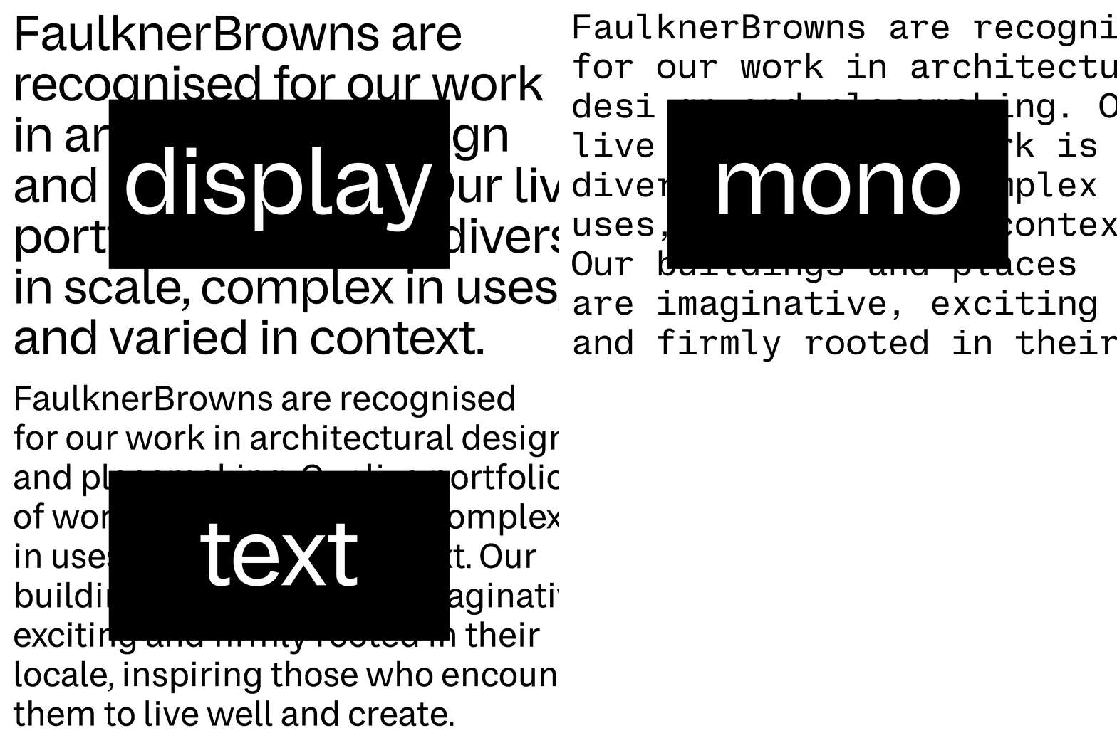
»From the beautiful expressive Display to the legible Text & the practical Monospaced, the FaulknerBrowns type family is a visual communication tool for the company in spirit and practical terms«


»Attention, information & identity were the practical needs for FaulknerBrowns, especially the matching monospaced font, widely used for captions and project description was an interesting type family member developed during the project«


»A type family consisting of four fonts, designed to express the identity & designed to serve the purpose of communication. With the understanding of the client; how do they communicate, which platforms do they use, who will be using the typeface…? it was possible to design the perfect type tool«

Typeface: FaulknerBrowns Display, Mono & Text
Master design by Urgent.Agency
Client: FaulknerBrowns UK, Ireland & Canada
Agency: Urgent.Agency
Design date: 2024
Recognition: Shortliste, CCA 2025
Contact: Trine Rask
